MUH-TAY-ZIK | HOF-FER
San Francisco, CA. Excerpt from Office Snapshots: Rigorous thought drives the work of this quirky ad agency. The main concern of the client was the conflict between the weird/outlandish/wacky work they create – the works that makes them unique and cutting edge – and the fact that they have exacting standards and run a buttoned up business.
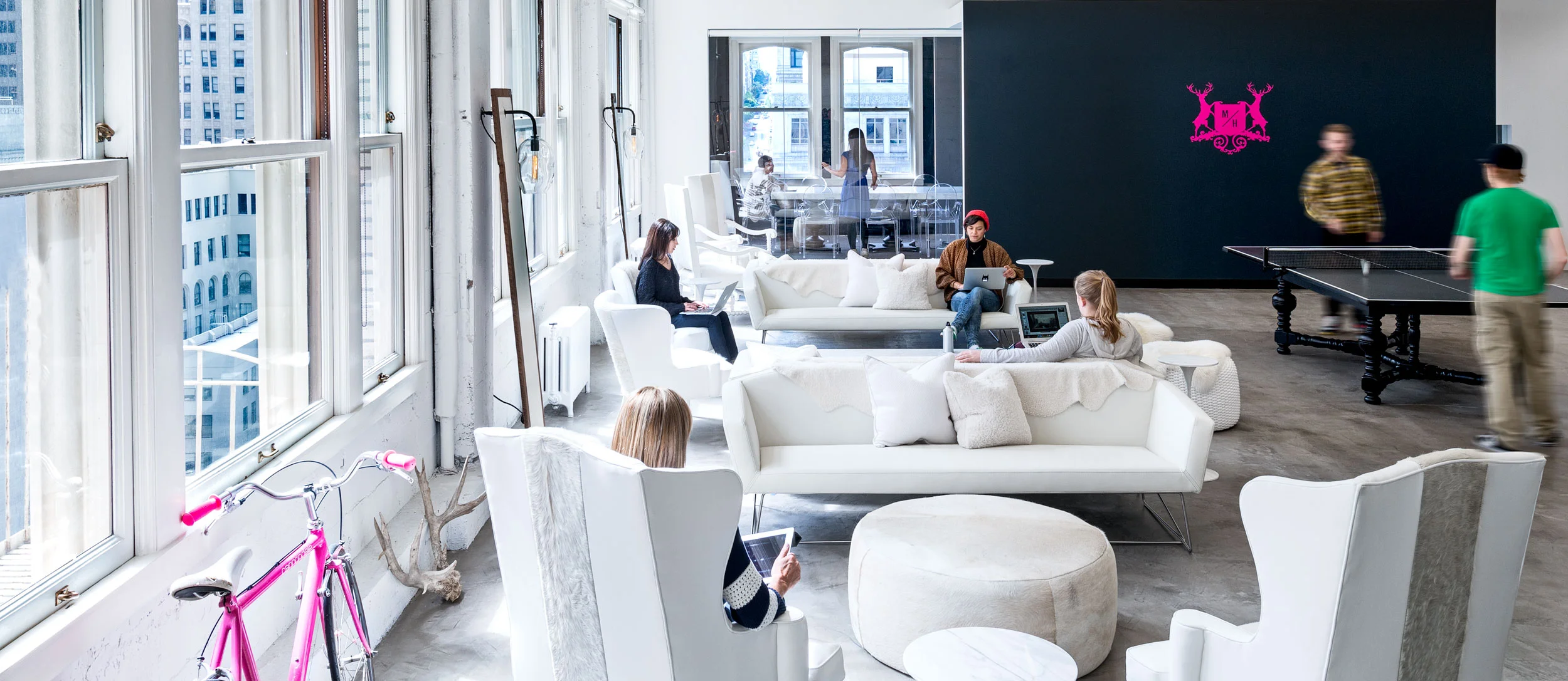
This dichotomy between the free-flowing creative thinker and the precise analytical thinker is what drives the concept of the space. The white canvas consist of the creative ‘work zones’ – the work setting, private offices, the team tables, the collaboration zones, and the café – all fall under this zone. These are the spaces to think and create where the color comes from the people and what they do. The black suit consists of the ‘client/formal spaces’ – the conference rooms, the editing suite and the reception. Black represents the clever, respectful, sharp side of MTZHF.
An eclectic mix of found and repurposed furniture completes the story. The space is quirky and buttoned up – a perfect representative juxtaposition for this ad agency that was honored by Ad Age with Small Agency of 2014.
Photographs commissioned by Gensler
Photographer: Jasper Sanidad
Production / Camera Crew: Whitney Sakae Beers
Post Production: Jasper Sanidad, Whitney Sakae Beers


